Category Archives: data presentation

A Massive Fail in Presentation

I recently came upon a webinar hosted by two environmental consultants, Mike and Amy. The webinar was called “Improving Training Effectiveness through Accelerative Learning”. As an environmental trainer who has conducted seminars and webinars on environmental compliance for thousands of environmental managers, I was very curious to learn about this “accelerative learning” process which sounds like something revolutionary and innovative. I logged on to the webinar with an open mind and eagerness to learn new training strategies.

It was a major disppointment.

The webinar begins with a four-minute self introduction of the speakers. A self promotional spiel. This is one of the common mistakes made by speakers. They fail to realize that the participants are there to learn about the topic. The fact that they are there is fair assumption that they already know about the qualifications of the speakers. The time to brag about your qualifications is BEFORE they sign up for your talk. So someone who is anxiously waiting to find out more about the topic is forced to sit through several minutes of tedious tripe.

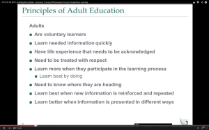
Mike then proceeds to go through bulletpoints – one by one until they build up to a screen full of nine bulletpoints after 13 minutes. The big problem with mikebulletpoints is that they are a big distraction to the audience. As the speaker is talking about bulletpoint #5, the audience is free to roam around and is probably reading the previous four bulletpoints. By the time we get to the last bulletpoint, hardly anyone is listening to the speaker. Some are probably in a coma.
A much more effective means of presentation is to show each talking point (in the form of a short sentence) coupled with a relevant picture in EACH slide. Let’s say you are talking about how to reef a sail on a sailboat. Show a photograph of someone reefing the sail on a sailboat and talk about how to do it. And then you move on to the next slide with the next talking point in a short sentence coupled with an appropriate photo. That’s how you KEEP your audience’s attention to what you are saying. Their eyes cannot meander to your previous talking points.

How many times have we attended a conference where the speaker splashes 10 bulletpoints on the screen and then proceeds to read them out loud one by one? Look around the room and you will find many people dozing off or working on their crossword puzzle.

There is a reason bulletpoints are also known as electronic chloroform.

The second speaker Amy does a similar thing except she embeds her bulletpoints in diagrams so that at the end she has a collage of diagrams with multiple bulletpoints embedded. The audience will do the same thing as they do with Mike’s plain old bulletpoints. Their eyes will be wandering all over the diagram and their minds will tune out what she has to say.

Here is another example: When she talks and shows a pyramid as shown here at amythe same time, the audience will be accelerating through all those words on the diagram and not be listening to her important message. That’s hardly effective learning.
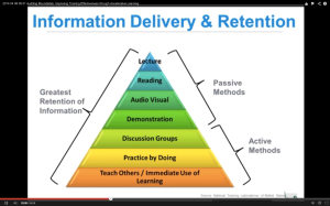
Amy mentions decades and decades of brain research on learning. The landmark research done on cognitive learning is by Dr. Richard E. Mayer – a professor of psychology at the University of California Santa Barbara. His research shows that people take in much more information and retain more when they are presented with a short sentence words and an accompanying visual. Lots of research papers have been written on this topic.

I never did finish the webinar. It was dreadfully boring and I felt myself lapsing into a coma. The only way I can stay up was to stab my leg with a sharp object to keep me from dozing off.

In sum, presenting multiple bulletpoints on a single slide is NEVER an effective way to communicate to any audience. It is a major distraction. Speakers use bulletpoints to remind them of when they need to say what – much like a cheap teleprompter. And that’s fine. But there is no need for the speakers to show the audience their teleprompter.

The cardinal rule of good presentation or public speaking is this: always make sure your audience’s focus is on you – the speaker and the spoken words – not words on the screen.

The most effective to make a presentation to an audience is to TALK to them. You are having a normal conversation with each and every one of the audience. You tell stories of real-life examples that relate to the audience. You never use electronic chloroform to put your audience to sleep.

It is a cruel and unusual punishment.

A great video on how NOT to do PowerPoint

This is by far the BEST video on how NOT to make your PowerPoint presentations.

A short video on why most PowerPoint presentations suck

I recorded this video using http://www.presentermedia.com’s 3-D animation. I am not a big fan of cheesy clip art and animation in slides. But I am going to make an exception in this case. The 3-D stick figures are classy and are not obnoxious.

Q and A after my webinar

I did a webinar last week and about 130 people from all over the world attended. The topic was on How to Make a Great  PowerPoint presentation. At the end of the webinar, a number of questions (20 to be exact) were posed.

I have included the questions (unedited) and my corresponding answers to each one below:

Oues.1: Norman I use 3 to 4 bullet points in an slide, however when the slide is first shown the audience dose not see all the bullet points until I’m ready to discuss the next bullet point, I then click again (on the same slide) to reveal the next bullet and discuss it. This seems to work for me, what are your thoughts on this system reguarding bullet points.

Answer: That is better than showing all the bullet points at once. You don’t want the audience to get ahead of your talk.

Oues.2: While I agree with the basic points he made, (image with few words) his own slides were not particularly polished. (Blobs of blue with some text next to a picture). This webinar is good for presenters with little experience, but I was hoping for something more. He spent way too much time showing bad slides. (That case could have been made with 3 examples instead of 10 or more).

Answer: I showed 10 or more bad slides because there are so many bad slides out there. Not sure what you were hoping for. More bells and whistles?

Oues.3: I’m going to try Mr. Wei’s ideas in my next presentation. That said, the repetition in his slides and banter is crazy-making for me. That goes for the excessive examples of bad slides, to the excessive examples of 5 slides idea, and so on.

Answer: Glad you are willing to try out my ideas.

Oues.4: What about a slide with 3 bullets and one picture…is that bad?

Answer: Yes..that’s bad. Remember this: billet points are YOUR speaking notes. Why do you have to show the audience your speaking notes?

Oues.5: You’re repeating the slides many times. Is this done to help the audience remember the key points?

Answer: Yes..tell them what you are going to show, show them and tell them what you have shown. You remember them, don’t you?

Oues.6: Does using visuals for abstract ideas work even if the visual has no real basis in reality? Showing Rodin’s Thinker for example to demonstrate comtemplation?

Answer: If the topic is too abstract, show a picture and talk about it. If it is too abstract to show, do a handout.

Oues.7: I know you don’t like bullet points, but what do you think about the 6×6 rule?

Answer: Don’t believe in 6 X 6 rule. Six bullet points is 6 too many.

Oues.8: What are some good sources (preferrably free) for good pictures and visuals?

Answer: Take your own pictures if possible. Or go to istock. They are not free but very reasonable.

Oues.9: do you do web conferences?

Answer: Yes I do.

Oues.10: Norman, how many slides was this presentation?

Answer: I used 111 slides and they were all FREE!

Oues. 11: What are your thoughts about handouts of the presentation? My bosses believe that you should have the least amount of slides as possible because they always do handouts of the presentation.

Answer: Always handout the material at the END of your presentation. You do not want your audience to be reading your handout while you talk.

Oues.12: one question what if we include animation or excel sheet

Answer: Do not use animation unless you are presenting a cartoon show. Imbedded videos are fine. No excel sheet! Audience can’t read and analyze the numbers while you are talking!!

Oues.13: What about audience expecation tho? Some people expect to see many words, and if they don’t, they believe you haven’t delivered!

Answer: Audience wants many words on the screen? I don’t think so. Just becasue th audience is used to crap (bullet points) is no reason to give them crap. You deliver by TALKING about your ideas – not reading them off the screen.

Oues.14: how about calculations and formulae? is there a place for pics?

Answer: Use simple pics for formulae. If it take 5 pages to explain your calculation, give them a handout. There are presentation tools out there that allow you to do sketching and draw out your formulae.

Oues.15: What is your feeling of using fade in and out of points on a single slide using a representative, meaningful graphic.

Answer: A bit of fade in and out is OK. You do NOT want your audience to be distracted by the fancy animation unless you are doing a cartoon show.

Oues.16: should we include refrences in the presentation?

Answer: NO.  Give them a list of references in your handout at the END of the presentation.

Oues.17: The problem with having 100 slides is that you will, by default, spend 30 seconds on each slide.  That means you will have a 50 minute presentation which is too long in most cases.

Answer: There is no law that requires you to spend 30 seconds on each slide. You spend more time on some and less on others. If you only have 30 minutes, reduce the number of points in your presentation. You can’t tell the entire history of the western civilization in 50 minutes.

Oues.18: Does this apply in preparing for teaching university classes?

Answer: Absolutely….talk to the class and give handout at the end of a particular discussion.

Oues.19: do i have rehease the slide before presentation?

Answer: Rehearse the content and timing of the presentation. Do NOT memorize your talk. You don’t want to sound like a robot. Show passion! Not dullness.

Oues.20: A bit crude, but a boss once told me the infomation on a slide should be like a mini-skirt: long enough to cover the subject, but short enough to keep it interesting.

Answer: Yes..a bit crude but true nonetheless.

How to present data

I have often said that too many presenters simply splash their complicated data in tabulated form on the screen and expect the audience to decipher the trend. That’s just pure fantasy. There is no way anyone in the audience can determine the trend. Most tables are not readable because they contain 10 row and 10 columns!

Even a table as simple as this one can pose problem.

A much better way is to present the data in a simple chart – uncomplicated by legends and footnotes.

A glance at the chart on the left shows that fewer people are taking the subway and more are using their bikes. The bus trend stays pretty much the same with a slight decrease.


A really bad slide

I was at a conference yesterday and a speaker presented this slide and he immediately said:”I know you can’t read this….”.

So why would anyone in this right mind show the audience a slide that he KNOW to be unreadable? The funny part was that half of the audience was straining to read the tiny little numbers on the slides and paid absolutely no attention to the speaker.

Quit while you are ahead

During the French revolution three prominent, but very unfortunate, professionals were condemned to beheading by the guillotine: a priest, a doctor, and an engineer. The three were conveyed to the scaffold together in an old ox cart and were marched up to the guillotine together amidst amass of cheering blood thirsty spectators. The priest was the first to meet his fate. The executioner very politely asked the priest if he preferred to avoid seeing the blade fall by lying face down rather than face up. The priest replied, “I’ve led a good life, have nothing to regret, and want to meet my maker face-to-face.” So the priest lied down facing the blade. The executioner pulled the cord releasing the blade and it plummeted toward the priest’s exposed neck. But within a half inch of reaching its fatal destination the blade stopped literally in its tracks. The crowd roared with delight and many of the onlookers fell to their knees in prayer. Not wanting to put any victim to double jeopardy the authorities released the priest, to the great delight of the crowd.

Then came the doctor’s turn. He was asked the same question and thought “if it worked for the priest maybe it will work for me too,” so he requested to take the blade face up. Again the blade stopped a half inch from the target, and as with the priest, the authorities released the doctor.

Now was the engineer’s turn and, being no one’s fool, he also opted to take the blade face up. As he lay with his neck firmly placed in the crook of the guillotine and looked up to his maker, and to the blade, he exclaimed, “Ooh, I think I see your problem.”

Moral of the story: Quit while you are ahead. No pun intended.

Once you have made a point in a presentation, it is time to move on.

Full credit for this funny tale goes to Barry Trilling – a prominent attorney.

Why most PowerPoint Presentations Suck

I just love this video on why most PowerPoint presentations suck – BIG TIME. The point the speaker raises is very valid. People spend way too much time “jazzing up” their slides with those cheesy clip arts and silly animations.

Always use real photographs with your presentation – photos that add meaning and emotion to your presentation (conversation with the audience).

Another GREAT presentation by Steve Jobs

Here was Steve Jobs introducing iPad2. Notice not a bullet point in sight. His graphics are simple and straight to the point. He was having a conversation with his audience. He rehearsed enough to know which slide came next. But he did not memorize his talk. He just knew what he was talking about. And best of all – he was having FUN!!!

This is how a presentation should be done.

Strategic Listening as part of your presentation

In an earlier post, I  wrote about listening with your eyes when you are making a presentation. You don’t do that by splashing a bunch of hideous bullet points up on your screen.

LISTEN to what Tom Peters has to say about listening and try to apply it in a presentation.

You do that by NOT interrupting a member of the audience when she asks you a question. You listen to the entire question before opening your mouth.