
This was a webinar hosting by the Training Magazine Network. The topic was on how to keep your audience from becoming “dazed, confused and bored” in a training session. It offered 7 ways to accomplish this lofty goal.
The first 4 minutes were spent on explaining the features of the page. What does “Q&A” stand for. What does the little bird stand for (hint: twitter) and the background of the presenter. All done by the moderator in a monotone. I was getting a bit dazed 5 minutes into it.
Then came the presenter – a vice president of some virtual learning strategy firm. He started by showing 3 bullet points and reading off them. He did expand on them a bit. So it was not just a verbatim reading of the words. Then came the next slide with 4 bullet points and the same reading out loud of these bullet points that were clearly visible AND readable to his audience. I could not remember what he said about the first bullet point becasue I was already reading the 4th one. He stumbled a bit in reading his own slides and apologized for “not being to read too well” that day.
By this time, I was dazed and a bit confused.
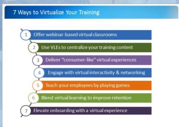 Then at 9 minutes, he flashed a slide with ALL 7 of his magical ways to keep the audience from getting dazed, confused and bored – in 7 bullet points. He then droned on in his monotone about those 7 points which I could clearly read.
I was getting bored, a bit dazed and kind of confused at this point.
The presenter then flashed a slide with 12 bullet items on it and started to read them off one by one.
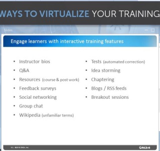 So I took a screen shot of the 7 bullet points and the 12 bullet points and left the webinar.
It is all there, so why waste 50 more minutes of my time?
Besides, I was dazed, confused and totally bored.


Yes, sadly nothing’s really changed with the state of most webinars in the last couple of years.
It’s good to see the screenshots you took, and at least the rainbow-like one is more artistic than most slides. (To me it looks like a graphic designer’s work – though the rather vivid colours aren’t a good choice.)
I reckon the hosts should’ve read and acted on How to rock at webinars – 9 concrete tips to keep people engaged. But I guess I’m biased. Still, let me know if you think a few of those would’ve helped.
Wow – I didn’t know these webinars could be so bad! I guess when you’re presenting so much in a purely visual way, and you can’t physically see the speaker, the temptation must be to litter the screen with info-filled slides. Well done for surviving!
MAtt…to be fair, I didn’t really survive this webinar. I quit watching after 10 minutes of drivels because I was dazed, confused and bored.