Monthly Archives: May 2009

The use of technical jargon and acronyms in presentations

alphabet soup1Many people use a lot of technical jargon and acronyms in their presentations because it gives them a sense of superiority over the common folks. This is particularly true with scientists and engineers. They like to speak “a language of their own”. That’s fine if everyone in the audience has the same training and understanding of the topic being presentation. But that is never the case.

You should use acronyms sparingly and only if the terms they represent are going to appear throughout the entire presentation. But many presenters use acronyms only once in their presentation. They end up offering an alphabet soup to the audience that is hard to digest with the inevitable result.

brainrulespzreview-1211213300619507-9_Page_042

They never learn, do they?

SESHA -redick 4I was at an environmental conference in Phoenix that was hosted by the semiconductor manufacturing industries. Lots of talk about greenhouse gas and environmental sustainability. Many scientists and engineers gave talks and all of them were in PowerPoint format. with one exception, all of the PowerPoint presentations had too small fonts, too many bullet points and too many abbreviations.

The attached slide on the right has 11 abbreviations (ASTM, ANSI, SEMI, S23, GRI, SDO and so on), 6 bullet points, 13 sub bullet points and 2 sub-sub bullet points. All cramped into one SINGLE slide! The presenter is an attorney.

The font size in another presentation was so small that the bullet points were not readable from the back of a relatively small room. 

too small prints


For a copy of my presentation (without any bullet points) on environmental sustainability, click here.

How to make great PowerPoint presentations

The basic rules:

1. Do not use bullet points

2. Use one point per slide with an appropriate image

3. Use as many slides as you have points

4. The first 5 slides are the most important ones.

tell me a storyClick here for a brief slide show that demonstrates this concept.

How NOT to present scientific data in a presentation

ghg pricesWhen presenting scientific or technical data, many people make the big mistake of treating the presentation as the oral form of a scientific or technical journal. That’s why they jam every possible number and footnote onto a single slide thereby making it totally unreadable to the audience.

The way to do it properly is to pick out the essential points of the topic and focus on them one point and one slide at a time. You can include all your footnotes and references in a handout AFTER the presentation. Or you can tell the audience where they can download the information from a website.

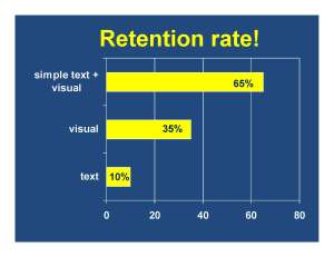
Never throw a bunch of numbers up on a slide. Never show a big matrix of rows and columns of numbers in a presentation. If you intend to demonstrate a trend, show a simple graph or bar chart. and the key word is “simple”.  You need to do the number crunching for the audience. In other words, do not expect the audience to sit retention ratethere and figure out a trend from your raw data. They won’t do that. And if they do, they will definitely not be paying attention to you. 

Your slide should not be any more complicated than the slide to the left. Any more words or numbers on that slide would make it too busy to read. 

Simplicity is the key to any PowerPoint presentation.

More horrible slides!

In this post, we look at a couple of incredibly horrible slides prepared by the U.S. Environmental Protection Agency. These two slides come from a stack of some 193 slides in a presentation bad-slide-s2191_epa_analysis-32that analyzes a proposed Senate Bill on climate change. This topic in and of itself is an exceedingly complicated scientific subject to discuss. Just imagine the poor audience who sat through those 193 slides.

I defy anyone to read any of these slides.

Apparently people no longer prepare written reports. Everything – no matter how complicated – is presented in PowerPoint slides loaded with bullet points. 

 bad-slide-s2191_epa_analysis-44